Potteke
This project was incredibly special to me not just because it was my first real branding project, but because it was for someone close to my heart. My niece was launching her own low-waste household shop and she entrusted me with creating the branding for her new venture.
More than just a design challenge, this was an opportunity to support a cause I truly believe in: sustainability and mindful living.
From the ground up, I developed a complete brand identity that aligned with the shop’s mission.
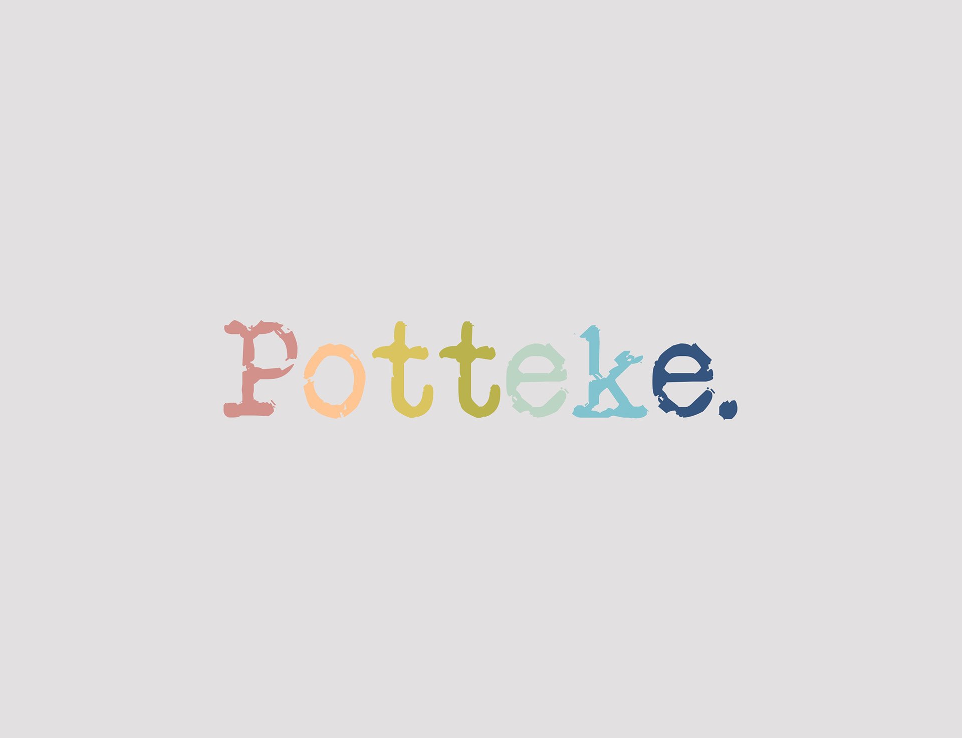
This included designing a logo that carried a deeper story.
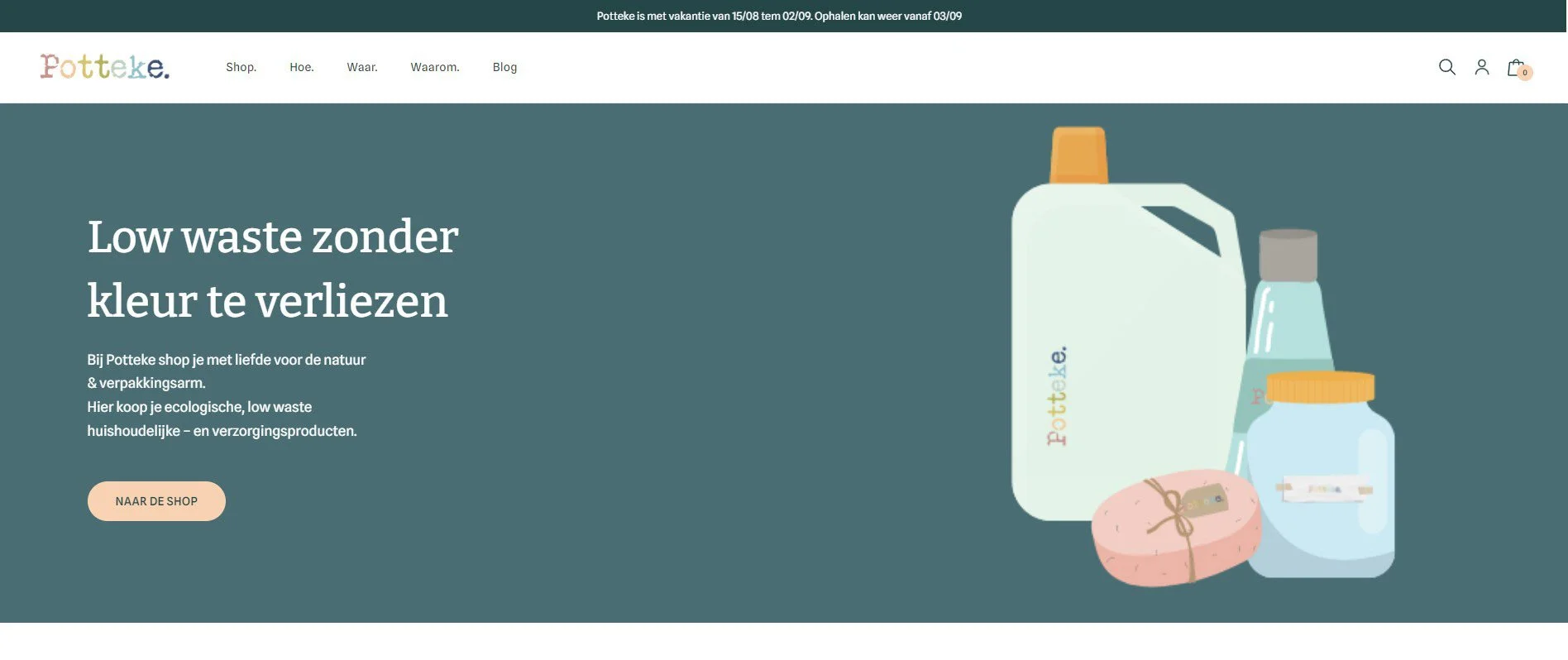
The inspiration came from a personal experience in 2019 when my niece and her two children participated in Scheldejutten at Stormkop in Antwerp, a cleanup initiative along the river. As they collected waste, they sorted it by color, which became a powerful visual reminder of the impact of pollution. I wanted to incorporate this idea into the branding, which is why each letter in the logo is a different color, symbolizing both the fragmented reality of waste and the effort to bring it together into something meaningful. Working on this project was both meaningful and rewarding. It allowed me to blend creativity with purpose and see firsthand how thoughtful branding can bring a vision to life.
Logo
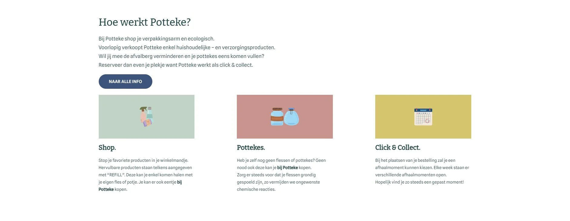
Homepage