CASE STUDY
One Digital Group
When a close friend launched One Digital Group, a new holding company,
I saw an exciting opportunity to craft a brand identity that reflects its innovation and digital expertise.
My vision was to create a bold, modern and cohesive identity that positions the company as a strong player in the digital landscape.
From a sleek logo concept to a well-defined visual language,
I explored how design could establish One Digital Group as a forward-thinking brand with a powerful presence.
This case study showcases my creative approach and the possibilities for bringing this vision to life.
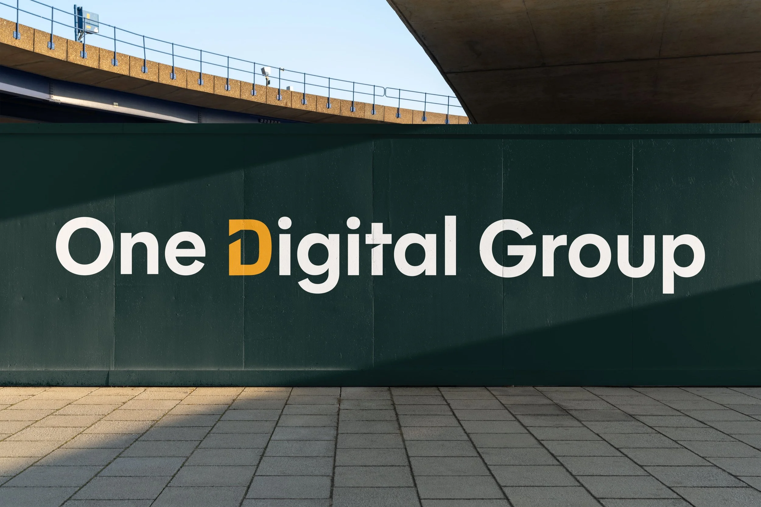
The main logo
This logo features a clean, modern, and professional design that reflects the company’s forward-thinking digital identity. The typography is bold and minimalistic, ensuring clarity and strong brand recognition.
A key element of the design is the stylized "D" in "Digital", which stands out in a warm orange hue.
This subtle yet impactful detail adds energy and a sense of movement, symbolizing innovation, progress and digital transformation. The contrast between the vibrant orange and the sleek white text on a dark background creates a striking and sophisticated look, reinforcing the brand’s authority in the digital space.
This logo balances professionalism and creativity, making it versatile for various applications while maintaining a distinctive and recognizable identity.

The One Digital Group logomark takes the standout "D" from the full logo and transforms it into a powerful, standalone symbol.
The sharp, angular cut at the top left creates a sense of motion and innovation, reflecting the company’s forward-thinking approach.
The bold orange color ensures high visibility and impact,
making the mark instantly recognizable.
Set against a deep, dark background, it exudes confidence and modernity. This logomark is designed to work seamlessly across different platforms, maintaining a strong and cohesive brand presence.

A strong brand identity isn’t just about a logo. It’s about how it comes to life in the real world.
Below, you’ll find real-life applications of the One Digital Group branding, showcasing its versatility and impact across different mediums.
From a totebag that turns the logo into a stylish, everyday statement piece to name cards that make lasting first impressions, each application reinforces the brand’s modern and professional image.
The billboard sign takes the branding to a larger scale, ensuring visibility and recognition
in high-traffic areas.
These examples highlight how the One Digital Group identity remains bold, clear and memorable,
no matter where it’s used.