For Maki Productions, I set out to craft a brand identity that captures their core: creativity, curiosity and the beauty of real, unscripted moments.
Inspired by the playful yet confident character of the maki, the visual language reflects a balance of bold expression and clean clarity,
from dynamic typography to a warm, distinctive color palette.
This case showcases the full branding system I designed:
a story-driven logo, thoughtful typographic hierarchy and a visual universe that supports Maki Productions’ mission to observe, connect and create with authenticity. Here, you’ll find an inside look at how the brand came to life.
Maki Producitons
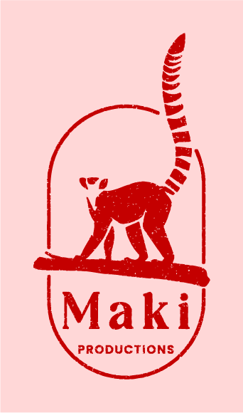
The main logo
The main logo for Maki Productions is designed as a visual embodiment of the brand’s spirit: curious, playful and creatively unbound.
At the center stands the ring-tailed maki, a character chosen for its expressive nature and instinct to observe the world with alert curiosity. Positioned confidently on a branch and framed within a clean oval shape, the maki becomes both a storyteller and a guide.
One of the key features is the tail breaking through the frame,
a subtle but deliberate gesture that represents
creativity going beyond boundaries,
a core value of Maki Productions.
The overall form remains bold and minimal, ensuring instant recognition while leaving space for personality and narrative.
The logo isn’t just a mark; it functions as the brand’s first impression and a symbol of the honest, real moments Maki Productions aims to capture. It combines playfulness with purpose, turning a simple icon into a story of creativity, observation and authenticity.
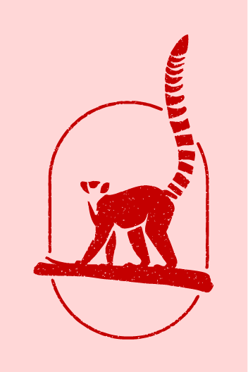
The logomark
The Maki Productions logomark distills the brand down to its most essential symbol: the maki itself. By removing the text,
the focus shifts entirely to the character and the story it carries.
The upright posture, expressive silhouette and signature tail breaking through the frame all highlight the brand’s core values:
curiosity, agility, and creativity that refuses to stay confined.
Designed to be bold yet minimal, the logomark maintains
strong visual clarity across all sizes and applications.
Its clean shapes and confident presence make it versatile enough for digital, print and smaller-scale uses where the full logo might lose impact.
More than an icon, the logomark stands as a compact expression of Maki Productions’ identity: playful, observant and always reaching beyond the expected. It’s a memorable mark that captures the heart of the brand in its purest form.
The typography and brand colours
The visual language for Maki Productions is built on a careful balance of expressive character and modern clarity.
The typography plays a central role in this identity. Orange Squach introduces a bold, playful voice. Perfect for headlines that need to stand out and set the creative tone.
Paired with it, Poppins provides structure and readability through a flexible hierarchy, using semibold for subheads, medium for body copy and regular for supporting text. Together, they create a dynamic rhythm that feels both energetic and approachable.
This typographic system is supported by a colour palette that reflects the emotional depth of the brand. Engineering Orange brings energy and curiosity, acting as the visual spark throughout the identity. Misty Rose adds warmth and a human touch, while Black Bean offers grounding contrast and sophistication. Pure White introduces balance and clarity, giving space for the other colours to shine.
Combined, the typography and colours form a cohesive visual foundation, expressive enough to capture attention, yet refined enough to communicate with confidence and consistency across every application.
The brand implemantations
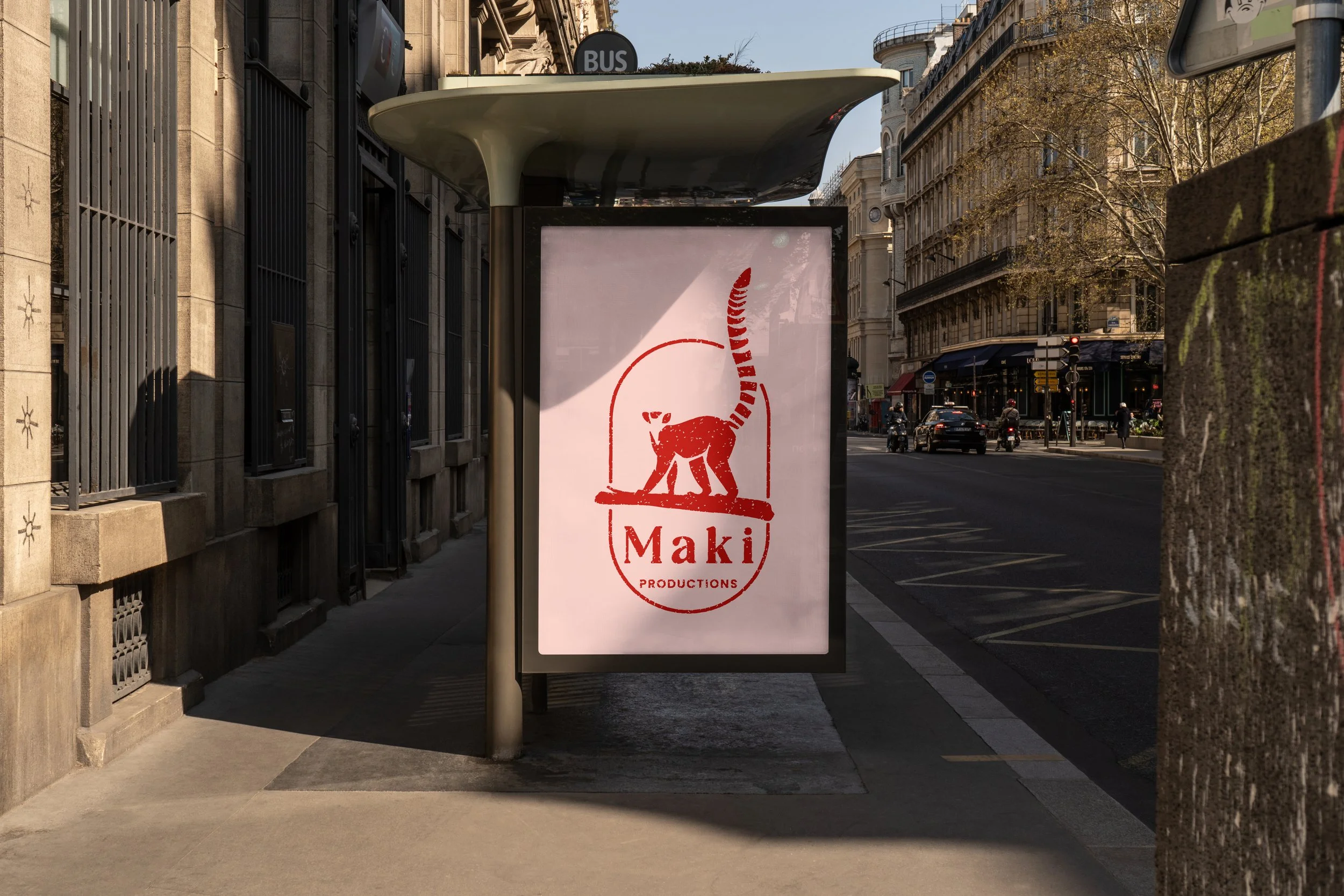
The brand comes to life through a series of tangible applications that showcase both its personality and versatility. Each asset highlights a different facet of the visual identity while maintaining consistency across typography, colour and the expressive maki symbol.
The business card is designed with clarity and confidence, pairing the bold logomark with clean typography
to create a professional yet approachable first impression. Its minimal layout and strong contrasts highlight the brand’s balance between playfulness and structure.
The poster amplifies the expressive side of the brand. With striking colours, dynamic typography and generous negative space it captures attention instantly. Embodying the creative energy that defines Maki Productions. It serves as a statement piece, turning the brand’s visual elements into a bold, communicative graphic.
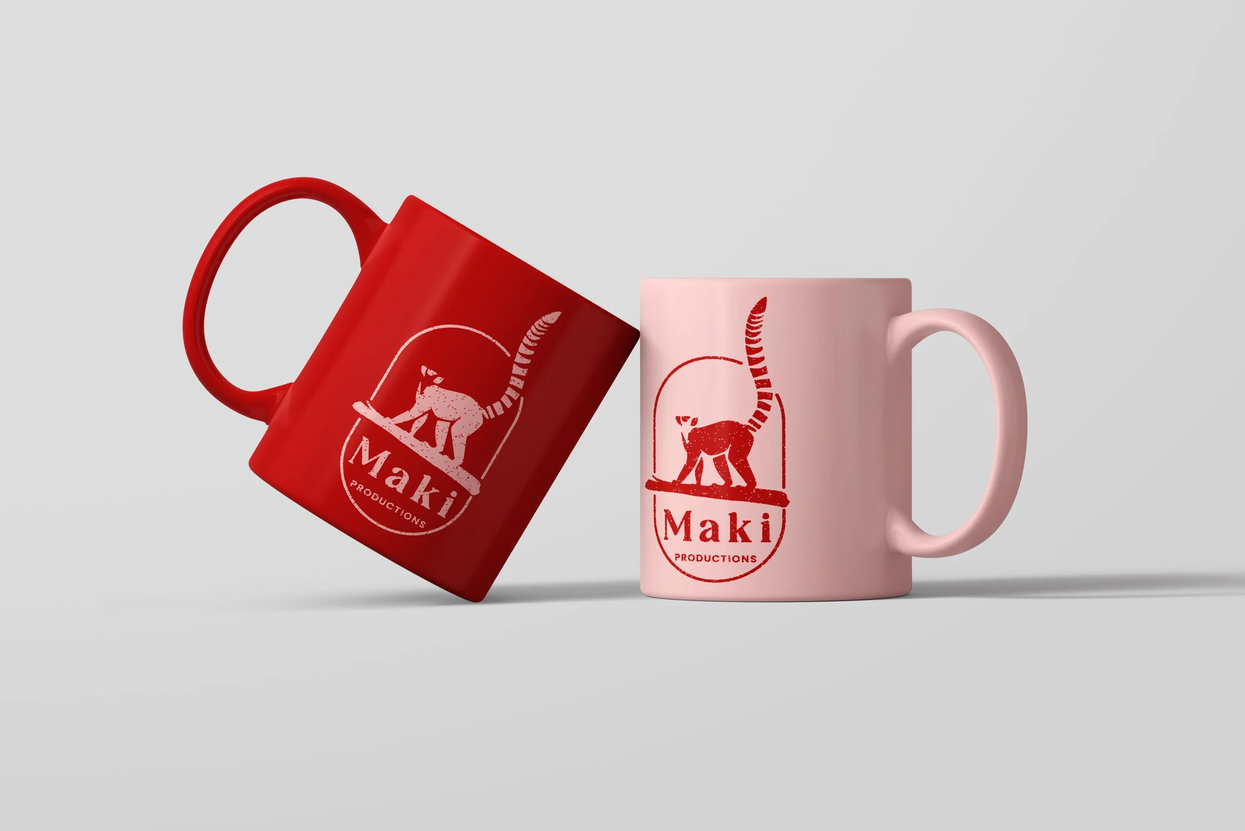
The mugs bring the identity into everyday use, showcasing the logo and colour palette in a friendly, tactile format. These items highlight the brand’s adaptability and charm. Transforming functional objects into recognizable touchpoints that strengthen brand presence.
Together, these implementations demonstrate how the Maki Productions identity extends seamlessly across print, merchandise and promotional materials.
Always staying consistent, expressive and unmistakably on brand.